Now I’ll be getting into a bit more detail on what kind of images a thermal camera produces and explain it to you how and why it is all a matter of interpreting that data and deciding how to show it visually…

How Does a Thermal Image Look Like
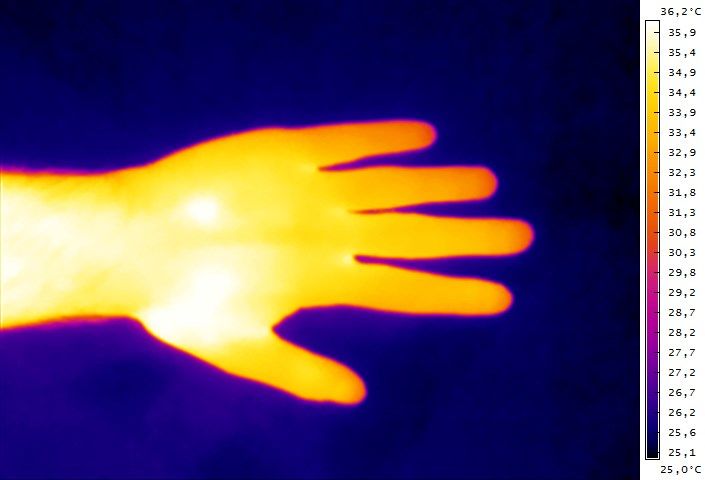
As I have already explained in my previous post the sensor of a thermal camera does not operate in the spectrum of visible light, but instead in a part of the infrared light and more specifically the Long-wavelength infrared region (LWI). This is the reason that these cameras do not record in color, though color is still used to make for a better and easier to read representation of the thermal data. Thermal cameras do record only temperature information for each pixel of the image they create instead of color information and then use software to turn that data in something visual and easy to understand and analyze. A special color palette is used with a different color mapped to a different temperature value and as a result you get a strangely looking image where different colors represent a different temperature. One of the most common such color palettes is called Iron and you can see a sample thermal image using this palette in the photo above, though this is not the only one. I’ll get more into the different representations of thermal images in a moment, but first I want to talk about something else as well…


